Inspo
How Hairline was made
Not with one prompt. With a long brief, a lot of questions, and every correction written down as a rule so it couldn’t come back. Claude Opus did the building, a live Artifact was the bench, and the judgement stayed with me.
01A feeling, not a look
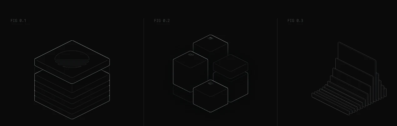
I’d been collecting interfaces that feel alive without moving much. One was a section of linear.app: three small line figures that answer the pointer so quietly you only notice late that they’ve been listening the whole time.
I didn’t want those figures. I wanted to know why the feeling works, so I could build my own on purpose instead of by imitation.
02The brief
The first prompt was long, and most of it wasn’t about drawing. It said what I was making, what I wanted to understand first, what was off limits, and what shape the answer had to take.
What I'm making
A small library of isometric line figures for product interfaces, drawn in SVG, that respond to the pointer. Not illustrations that sit there: instruments that read the cursor.
Understand first
The attached section is a reference for a feeling, not a look. Before you draw anything, take it apart. Give me numbers, not adjectives: timing, stagger, easing, how the response falls off with distance, how the frames are stored. Then tell me which of those choices make it feel calm.
Then rules
Turn what you find into rules I can hold a figure to, each sharp enough that I could reject a figure with it.
Then figures
Six at most. Each needs a reason to exist in a product, a way of answering the pointer, and the rules it leans on.
Off limits
Nothing of the reference survives: not its subjects, its frames or its code. One stroke width. No dependencies. Every figure holds up at 240px wide.
Shape of the answer
One Artifact I can play with, not a document I have to read.
03What came back
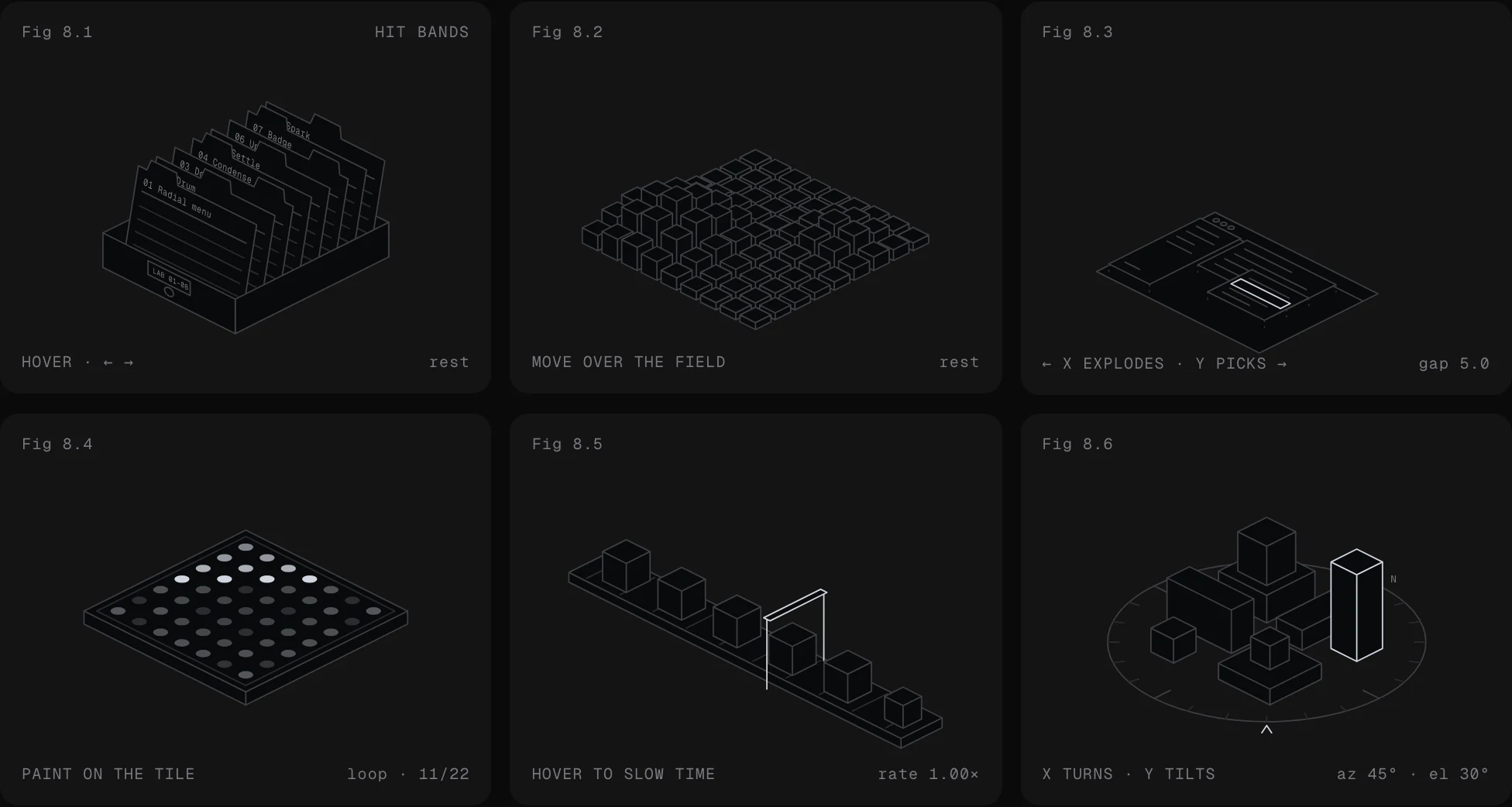
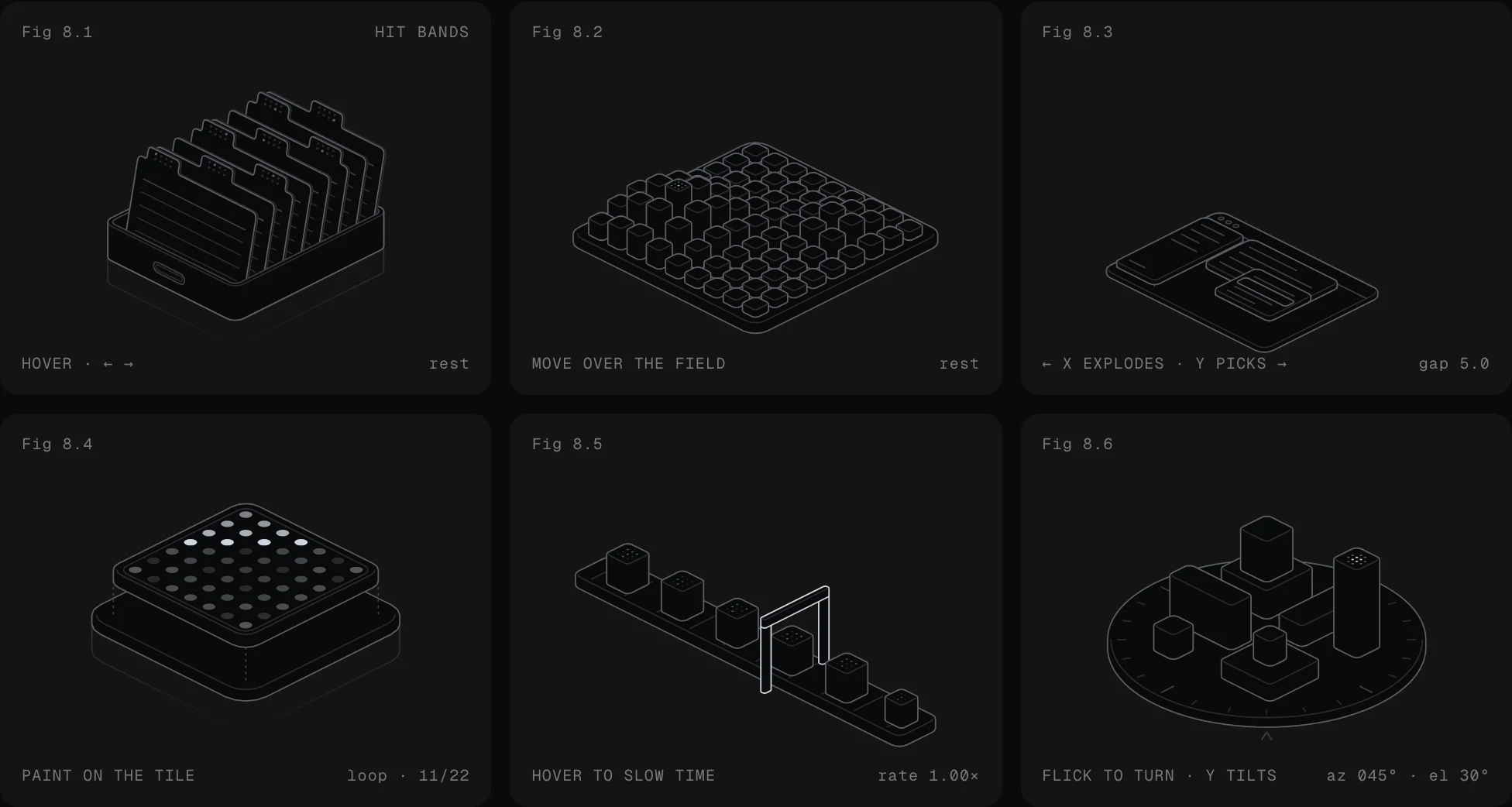
A dissection first, as asked: a 50ms stagger, one 700ms curve, cubic-bezier(.32, .72, 0, 1), a falloff that drops from 128 to 40 to 12 away from the pointer, frames stored as 25-bit masks. Then eight rules, and six figures built on them: Riffle, Terrain, Exploded, Phosphor, Slow and Turntable.
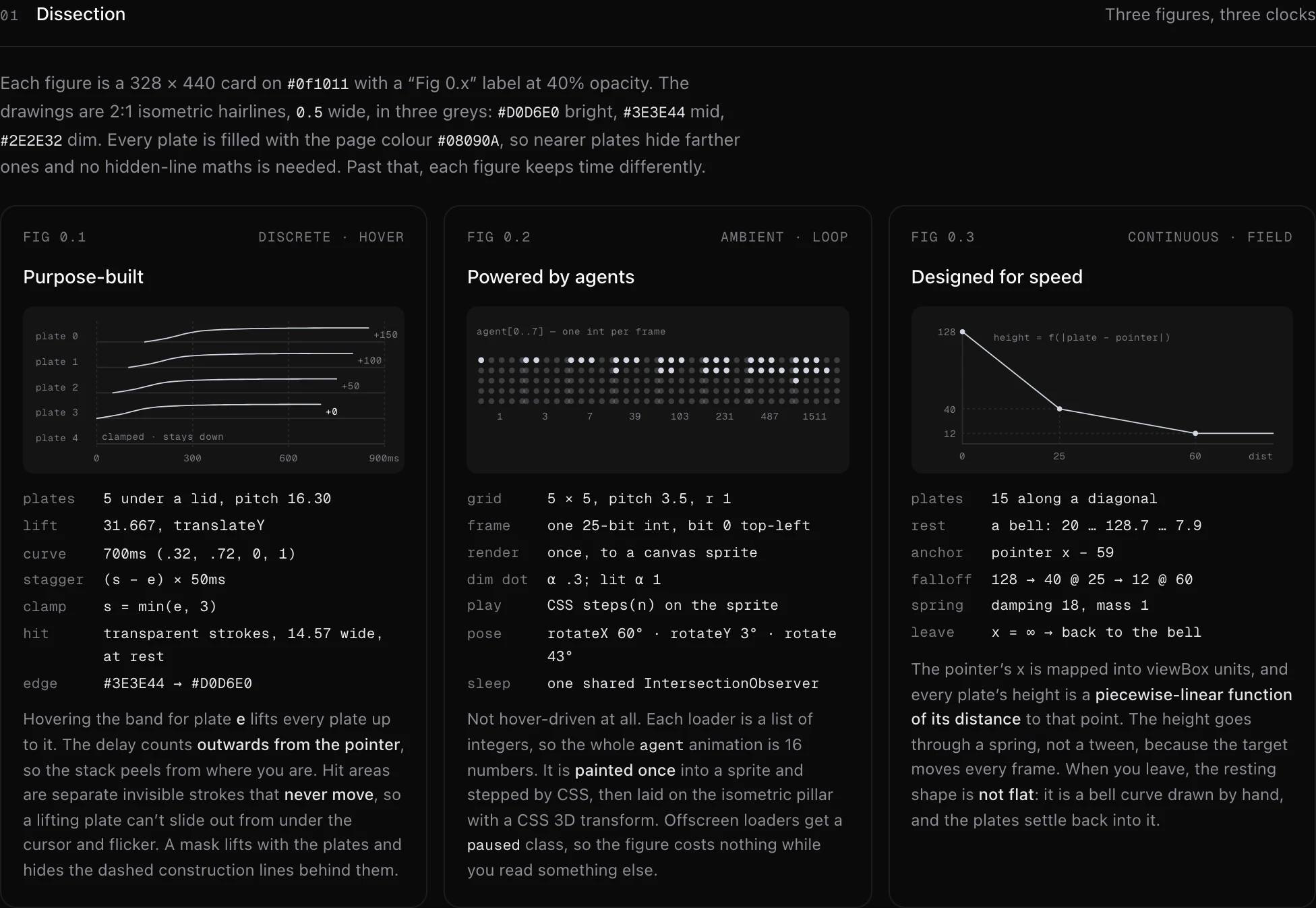
A good first draft. That’s all it was: something to argue with.
04Pushback
Most of the work happened here. I questioned every number I couldn’t feel, every figure I couldn’t explain, and every motion that looked fine in a still and wrong under the hand. A few of those turns:
“You say a 50ms stagger feels calm. Calm compared to what? Put it on a slider so I can feel 20 and 120, and tell me where it stops reading as a stack and starts reading as a wave.”
Every figure got a slider for the one number that shapes it, and the claims became something I could check by hand.
“Why is the falloff three steps instead of a curve? If the steps matter, show me the curve next to them and tell me what breaks.”
The steps stayed, as ratios: 1, then .31 at 42% of the radius, then .09 at the edge. Terrain uses them in two dimensions.
“At rest, Terrain is a flat floor. A flat floor is dead. Give it a shape before anyone touches it.”
The field rests as a designed dune with two rises, and every pillar settles back to it on its own spring.
“Riffle reads as a menu and Exploded reads as a screenshot. What does each one mean inside a product? If you can't say it in a line, change the figure, not the line.”
Each figure got a job written under it, and the rules it leans on. Anything that couldn't name one was redrawn.
“Slow's gate blinks on and off under the lintel. It should breathe: brighten as a crate comes, let go as it leaves.”
The glow swells over the whole gap between crates and lets go twice as fast as it lights. That one took three rounds.
Asking for sliders was the turn that paid most. Once the Artifact was a bench instead of a document, I stopped reading claims and started judging by hand: drag the knob, move the pointer, say exactly what feels off.
Those knobs later collapsed into a single option, intensity.
05The design pass
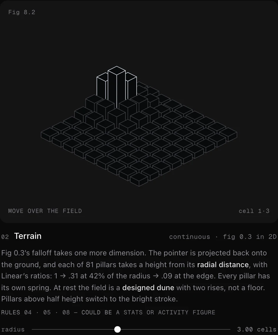
The motion was right; the drawings weren’t mine yet. A model won’t flag that on its own, so I wrote the critique the way I’d give it to a designer: what’s wrong, why, and the exact fix.
Keep
The motion. Don’t touch timing, easing or falloff.
Corners
Every corner is hard. Round them properly: a solid is the hull of two rounded rings, not a box with a radius pasted on.
Weight
Every edge has the same weight, so nothing reads first. Make the silhouette bright, leave one dim crease inside, and stop drawing the vertical corners; the eye fills them in.
Words
Take every word out of the figures. If a figure needs an identity, carry it in geometry. Names go in the corner read-out.
Write it down
Make these rules 09 and 10, so the next figure can’t break them.
- Rule 09
Round every corner, then draw less.
A solid is the hull of two rounded rings. Its vertical corners are never drawn, its top edge is one dim crease, and a thin plate gets a single thickness line. Bright outside, dim inside.
- Rule 10
No words inside the figure.
Geometry carries identity: a punch on a card’s tab, a dot code on a crate’s lid. Names go to the read-out in the corner.
06Into a package
The API was a design decision too. Six sliders became one intensity, because nobody using a figure should need to know what a falloff is. theme covers light and dark; label and onRead carry the read-out the words moved to. Then this site, and more arguing: Slow’s gate was still being tuned after the figures shipped.
07What I’d keep
- Write the brief like a spec: what it is, what to understand first, what’s off limits, what shape the answer takes.
- Ask for numbers and reasons, then argue with them. A first draft is something to push against.
- Make the model build the instrument you judge with. Sliders beat descriptions.
- Turn every correction into a rule, so it doesn’t come back two figures later.
- Taste is the part the model doesn’t bring. Look hard, then say exactly what to change.
The reference image belongs to Linear and appears here as a reference only. The figures and the code in Hairline are original.